This article is valid for Smart ID Mobile App 5.4 and Smart ID Mobile SDK 3.0.0 (for iOS) and Hermod 3.1.1 and later.

When a mobile virtual smart card is provisioned, the front layout and optionally the back layout of the card can be defined. The back side of the card is protected by the user PIN.
Example - Provisioning command with visual data
The provisioning command in the Hermod API, POST /rest/command/provision, contains a "visualData" section within "profile".
If visualData is left out, then the provisioning operation will behave as before, without a visual ID.
  "provCommand": {
    ...

    "profile": {
      ...

      "name": "string",
      "servername": "string",
      "visualData": {
        "contentId": "string",
        "profileCard": {
          "back": {
            "data": "JWS string",
            "dataType": "JOSE",
            "key": "back",
            "textColor": "WHITE"
          },
          "front": {
            "data": "base64 encoded image",
            "dataType": "IMAGE",
            "key": "front",
            "textColor": "WHITE"
          }
        }
      },

      ...
    },
  }
Define card layout
A card layout can be defined during provisioning, in either of two ways: by including the actual data or by pointing to a content provider service where the image data is stored.
|
Parameter |
Value |
Description |
|---|---|---|
|
"contentId" |
"<unique identifier>" Example:
|
Unique identifier for the image data in the content provider, which is defined by The image data can be personalized including a personal photo or common for a whole organization or department. |
|
"data" |
"<base64-encoded jpeg image>" Example:
OR "<JWS with base64-encoded jpeg image>" Example:
|
Image data in base64-encoded jpeg format, with an aspect ratio of 1200:757. If this parameter is used, it has precedence over
The back data must always be in JWS format and signed with certificates given out by Nexus. |
If you need to set up a content provider, see Requirements on content provider API.
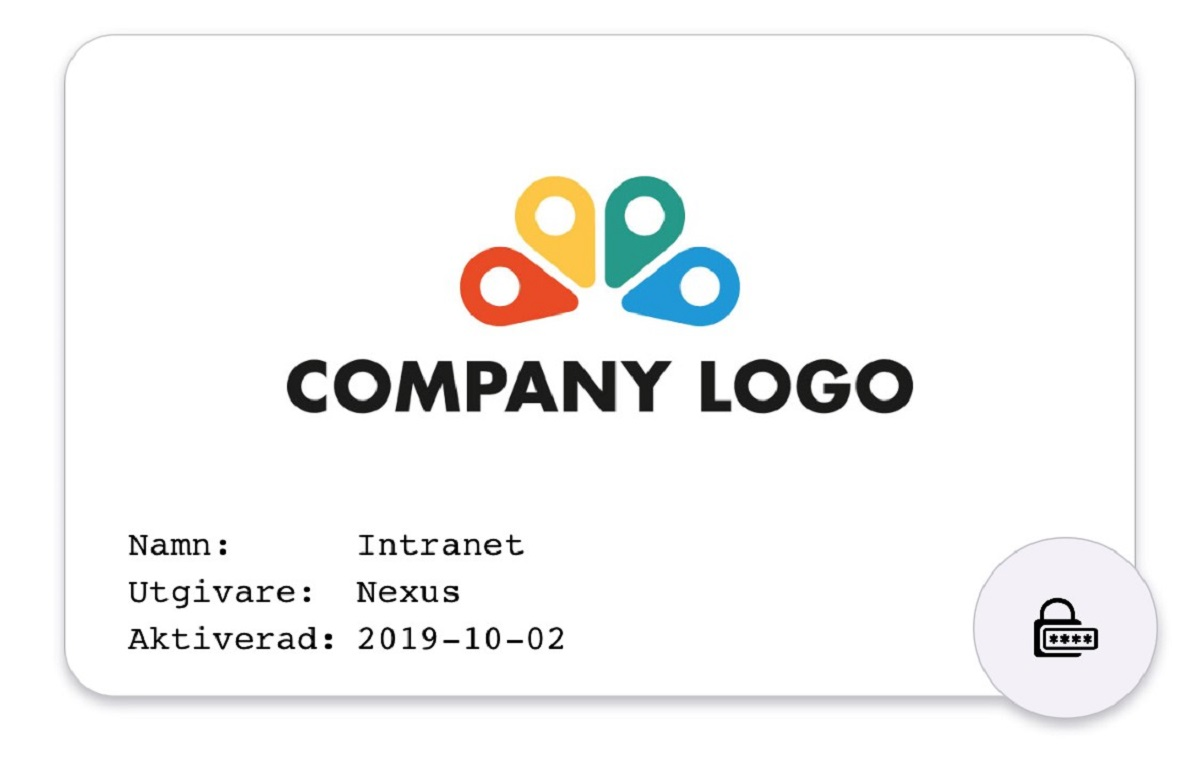
The front card layout should keep some space at the bottom of the card since this is where card information and icons will be overlaid. Refer to the example card layout below:
|
Front card layout example |
|---|
|
|
The color of the text overlay can be either white or black, which must be taken under consideration when creating the card layout design.
Note that the Mobile App automatically rounds the corners of the 1200x757 card rectangle, hence no back transparency effects are needed.
Define text fields
The following parameters are mandatory in the provisioning and the values will be printed on the card. To hide the texts, simply set text color to "CLEAR".
|
Text field |
Parameter |
Example values |
Description |
|---|---|---|---|
|
Name |
"name" |
"Anna Andersson" |
Typically the user's first and last name, but can also be a generic profile name as depicted in the example above. |
|
Issuer |
"servername" |
"Nexus Group" |
Typically the company name or department name. |
|
Activated |
- |
- |
Will be set to the provisioning date. |
The following text colors are available:
|
Parameter |
Allowed values |
|---|---|
|
"textColor" |
"WHITE" |
|
"BLACK" |
|
|
"CLEAR" |

