This article is valid for Smart ID 20.11 and later.
This article describes how to create or edit a form in Identity Manager Admin.

Prerequisites
-
Installed Identity Manager
-
Available identity template or data pool as reference for the search configuration
-
If needed: Available report configuration, to allow users to export the search results to a pdf report
-
Log in to the Identity Manager Admin as an
adminuser.
Step-by-step instruction
Add or edit form
-
In Identity Manager Admin, go to Home > Forms.
-
To add a new form:
-
Click +New.
-
Enter a Name and optionally a Description.
-
In Layout, select a basic layout. See Layout options.
-
Click Save+Edit.
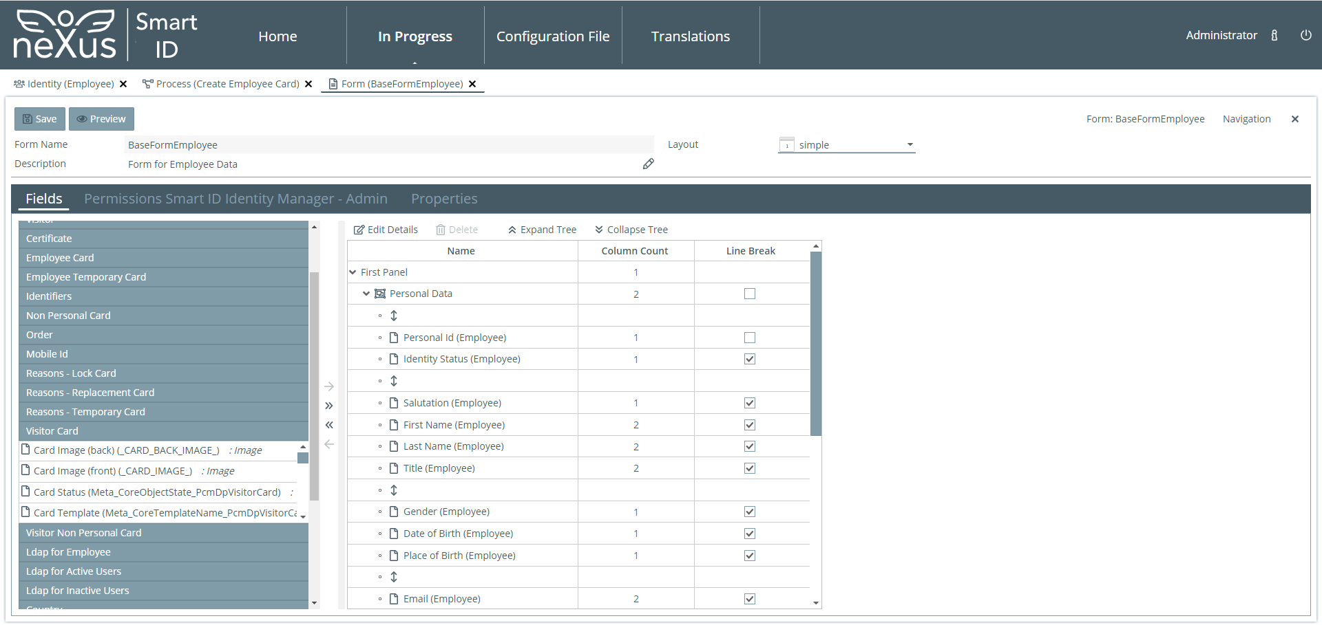
The Form panel is shown.
-
-
To edit an existing form, double-click on its name.
Set layout properties
-
In the Properties tab, set general Width, Height, and Label Width for the fields in the forms, either in pixels or as a percentage. By default, a width of 100 pixels is set.
Add, remove, or reorder data fields
The form elements already selected are listed in the appropriate order in the middle. The form elements are divided into groups in a tree structure. For ease of orientation, display or hide groups using the Expand Tree and Collapse Tree buttons.
Data of a data pool and meta data of a data object, for example object identifier, template name, and lifecycle state, can be viewed and edited in a form. The available form elements are shown for selection in several lists. Fields of each data pool, Structure Elements, and Predefined Pages are offered here.
-
To add a field in the form, either drag-and-drop an element from the selection list to the appropriate place in the list of fields, or use the right arrow buttons. The single arrow button places an element. The double arrow places all elements of a data pool.
-
Set the configuration options for the added field in the detail panel.
-
To change the order of the fields, drag-and-drop them to the desired order.
-
To delete a field, select it and either click on DELETE or on the left arrow button. The left double arrow removes all elements.
Set columns and headings
Set the layout of the fields in the form.
-
To let a field span over two columns, select the field and set Column Count to 2.
-
To get a new line after a field, select the field and check Line Break.
Add structure elements
In Structure Elements there are elements for the layout of the form.
-
To group fields under a common heading, add a Group.
-
To add a configurable text to the form, add a Text Element.
-
Use Horizontal Line and Row Distance for a nice layout of the form.
-
To add a search field, add a Search Element,. In Details, select a Search Configuration.
-
To add a field for free text input, add a Variable Field.
-
If multiple Card SDK printers are configured, use 'processVarCardSdkPrinterUrl'.
-
-
To add a link:
-
Select to add a Link.
-
Enter a Name of link. If this field is empty, the encoded URL will be displayed.
-
Enter a URL including the protocol.
-
The URL can contain a JUEL expression and the expression will be resolved.
Example: https://example.com/${Person_FirstName} will become https://example.com/John.
If the JUEL Expression cannot be resolved, the expression will be printed to the URL.
Change data field attributes
On the right under Details are all configuration options for a field.
-
Double-click a field to open the Details panel or select a field and click on Show Details.
-
Set the configuration options.
Examples:
To set a field to mandatory, check Required.
To set a field to a selection box, check Combobox.
Add translation to text
To field attributes with the translation icon, a translation can be added. For more information on supported languages, see Identity Manager requirements and interoperability.
-
To add a translation for an attribute, click on the translation icon, select language, and type in the text.
Preview form
-
Click the PREVIEW button at the top to see how the form will appear in Identity Manager.
Change permissions
-
To change the user rights to update and delete forms in Designer, go to the Permissions tab.
Save form
-
Save the form by clicking the SAVE button at the top.
Layout options
In the Layout selection box you can select the basic layout, for how the input and output fields are to be displayed.
|
Option |
Description |
|---|---|
|
Simple |
There is only one panel. |
|
Horizontal |
Panels are arranged one under the other. |
|
Vertical |
Panels are arranged side by side. |
Field attributes
Each data field has a number of attributes. The following table describes all the available field attributes.
|
Attribute |
Description |
|---|---|
|
General |
|
|
Type |
The type of form element is displayed here.
- Predefined page, for example captureImage |
|
Name |
Name of the form element. For the group, search element and variable field, the name can be given in more than one language. |
|
Width |
Width of the panel as a fixed size or a percentage. |
|
Height |
Height of the panel as a fixed size or a percentage. |
|
Help Text |
Multilingual help text for a group. |
|
Data Pool |
The field comes from this data pool. |
|
Data Type |
The data type of the variable field can be selected. |
|
Look |
|
|
Column Span |
Here you can enter how many columns a group or field is to cover. |
|
Line Break |
If this field is ticked, the field in the form is followed by a line break. |
|
Width |
Width of the field as a fixed size or a percentage. |
|
Height |
For binary data fields, the height of the field as a fixed size or a percentage.
|
|
Text |
This multilingual text is displayed in the text element. |
|
Font Size |
The size of the font for the text element can be indicated. |
|
Field Details |
|
|
Data Type |
The data type of the field is displayed here.
|
|
Help Text |
Here you can enter any text that describes the field. The text can also be entered in more than one language by clicking on the |
|
Edit Status |
There are three options for Edit Status:
|
|
Required |
If checked, this field must always contain a value. |
|
Download |
If checked, the download functionality is enabled. This is only available for binary data fields. |
|
Filename Pattern |
Defines the pattern used for the downloaded filename. You can use this only when Download is checked. See table below. |
|
Upload |
If checked, the upload functionality is enabled. This is only available for binary data fields. |
|
Delete |
If checked, the delete functionality is enabled. This is only available for binary data fields. |
|
Combobox |
The value entered in this field can be selected from a set of prescribed values.
|
|
Source of Selection Values |
Fixed values can be entered here or a data pool with the selection values can be selected. Or values in a configuration template. For example, to be able to configure Card SDK instances for printing of cards, chose Selection Type "Configuration Templates" and Template "Printers". |
|
Initialization Value |
The field is pre-initialized with the value entered here.
|
|
Validation Rule |
The value entered must comply with this validation rule. |
|
Multiline |
The text field can contain several lines. |
|
Password Field |
This allows to specify display settings for secrets to protect their visibility on forms.
|
|
Valid From/To |
A validity period for date fields can be configured here. This is only available for date fields. |
File name pattern values
These are the values for filename pattern.
|
Value |
Description |
Example |
|---|---|---|
|
JUEL expressions |
When a field is available on datamap, the expression will be resolved accordingly, otherwise the expression itself will be part of the downloaded filename. Remarks:
|
All fields available on datamap
Field not available on datamap
Field of type Date
|
|
plain text |
When no JUEL expression is provided, the result will be the plain text |
Filename pattern: example
|
|
empty |
When no pattern is provided, the result will be of format <Datapool_FieldName>.<binary_format> |
Filename pattern: (empty)
|
Filename pattern does not work in Smart ID Self-Service for binary format of type "Photo". It works though for other binary formats defined.
